 What's in a logo and
why does it matter?
By definition, a logo is a literal brand - graphic alone or with words - intended to provide instant identification of any commodity anywhere and everywhere it is seen. These days, event logos have become common, those intended to provide instant identification of some event that is being publicized.
Logos must be as simple as possible while being memorable, capable of being instantly imprinted and on the perceiving eye and mind, and thereforeto be henceforth recognizable. A logo can be just as memorable for being unspeakably ugly as it can be for being beautiful or just right.
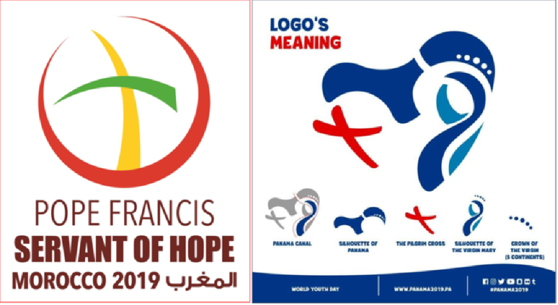
The latest event logos associated with an activity of Pope Francis are those of his coming trip to Morocco and of his third WYD outing in six years, the 2019 WYD in Panama.
The Morocco logo is fairly simple, once you know it is about the pope's trip to Morocco. It features the universal symbol of Islam, the crescent moon (seen on the logo as almost a full circular arc, instead of the half-arc that usually depicts a crescent moon), and the universal symbol of Christianity, the Cross.
Except that the Muslim crescent is seen to engulf the Cross and swallow it whole, and the Cross is fashioned out of two crossed scimitar blades. The metaphors it evokes are obviously counter-productive for the Catholic message, but then we know this pope does not always or necessarily have a Catholic message but quite the opposite.
Now we come to the 2019 Panama WYD logo which has too many elements in it and violates the rule that a logo must be as simple as possible. So many disparate elements that the logo had to be issued with an explanation of each of those elements. It was designed by a 20-year-old female university student in Panama who won a competition for the logo design.
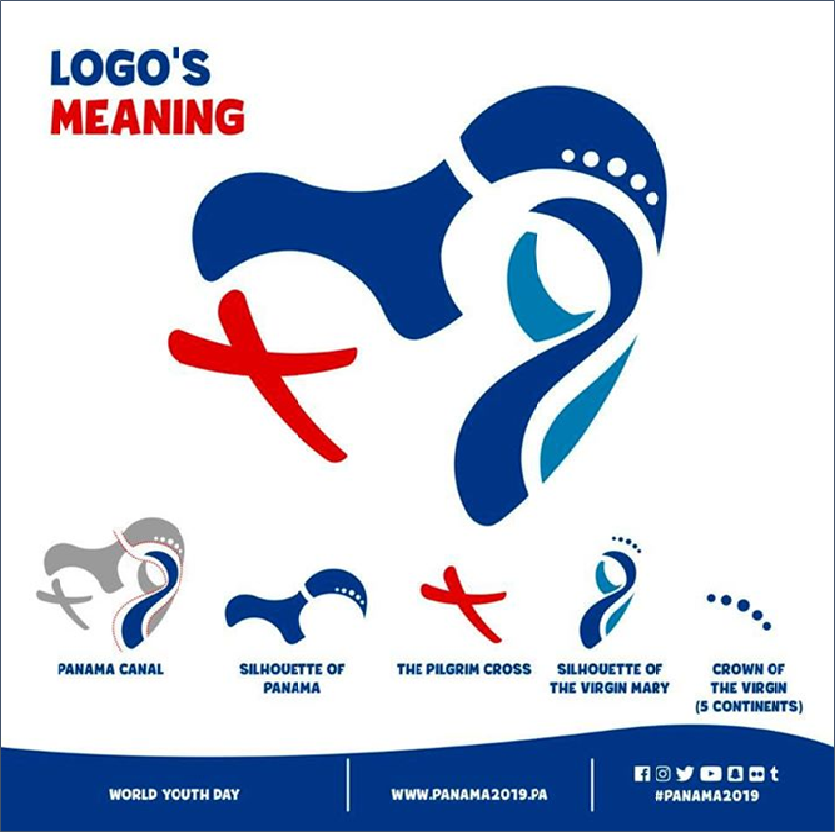
Minus the explanations, the first thing the logo suggests is the wide-open jaw of a coiled serpent preparing to devour the Cross. But no, the jawlike element and the other parts suggesting the body of a snake are supposed to represent, respectively, the geographical silhouette of Panama and an abstract configuration of the Virgin Mary. And yes, that the whole design is roughly the shape of a heart.
What a coincidence that both the latest event logos for the pope should suggest the Cross being swallowed up! Providence giving us objective correlatives for the Bergoglian mindset???
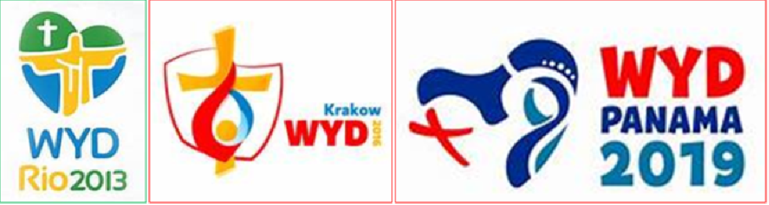
Anyway, just out of curiosity, I decided to compare the logos of the last six WYDs, including Panama:
Bergoglio's WYDs so far.
Benedict XVI's 3 WYDs:
The logo for WYD 2012 in Rio de Janeiro - one originally supposed to have been presided over by Benedict XVI if he had not resigned - is fairly simple, even as it locates the event without need to spell out Rio. Its main elements are a Cross and the gigantic Cristo Redentor statue with outstretched arms that dominates the city of Rio from Corcovado mountain; it also uses the distinctive yellow and green colors of the Brazilian flag, and blue for the sea that is so much an element of Rio.
The one for Cracow 2016 is a bit more complex. Cardinal Dsiwisz, in presenting it then, said that its frame is a geographical outline of Poland inside of which there is a yellow cross, representing Jesus Christ. The yellow dot within the frame both marks the position of Krakow on the map and serves as symbol for youth, while the red and blue flames are the flames of divine mercy from the image revealed to St. Faustina.
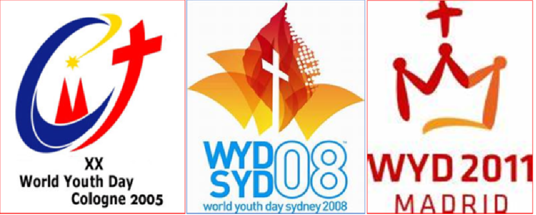
We come to the WYDs under Benedict XVI:
The logo for WYD 2005 in Cologne - one originally supposed to have been presided over by John Paul II who died in 2004 - is almost as complicated as the Panama logo, but there is no way it can be interpreted ambiguously. Its elements include the Cross; a yellow star with a cometlike tail symbolizing divine guidance, as in the star that led the Magi to Bethlehem, the Magi being the patron saints of the Cathedral of Cologne where tradition says their remains are buried; two red spires that represent the Cathedral itself; and the two blue arcs that have to be explained explicitly - the larger elliptical curve is supposed to stand for the letter C for Christ or for Church or for Communion; the lower shorter arc is meant to represent the Rhine river, along which Cologne is located, as well as the Barque of the Church.
The logo for WYD Sydney in 2008 is also fairly simple. Its main elements are the white Cross for Jesus as light of the word; orange and yellow flames representing the Descent of the Holy Spirit in tongues of fire; and the abstract outlines of Sydney's Opera House to indicate location.
The logo for WYD Madrid in 2011 almost needs no explanation. It is surmounted by the Cross, beneath which a stylized representation of youth holding hands and kneeling takes the form of the letter M for Mary , well as being the stylized outline of the Crown of Madrid's Our Lady of Almudena. Red and yellow are Spain's imperial colors.
[Modificato da TERESA BENEDETTA 28/01/2019 03:59]